

Digital Designer UX/UI
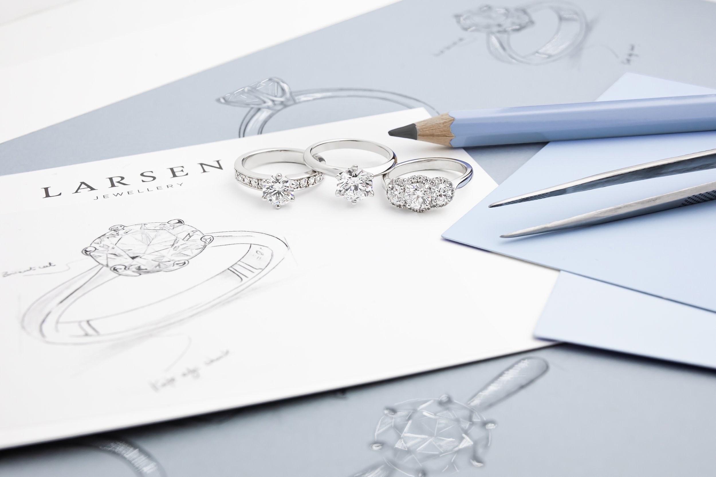
Larsen Jewellery
See more ↓
Client
Larsen Jewellery - Australia - 2023
Brief
Larsen Jewellery is a premium brand specialising in high-quality, ethically made jewellery. They offer a unique experience of creating bespoke pieces directly from their Sydney, Melbourne and Brisbane studios.
Role
Digital Web Designer UX/UI
Challenge
With plans to expand its online presence, Larsen needed to optimise the user experience and e-commerce funnel. The main goals were to increase engagement, revenue, and conversion rates.
Outcome
Remarkable improvements in the website's performance and user engagement metrics by implementing UX/UI strategies combined with data-driven insights.

Mega Menu Redesign
After reviewing the results of user testing, it became clear that the user experience of the product landing page (PLP) needed improvement. As the PLP is a critical component of the e-commerce website, directly influencing sales, it was essential to address any usability issues.

Problem
The original layout was outdated and difficult to navigate, resulting in high bounce rates.
To enhance the user experience, we adopted a user-centred design approach by conducting user research, creating prototypes, and conducting usability testing. Key improvements included simplifying the menu, organising content clearly, establishing a visual hierarchy, and conducting A/B tests for valuable insights.
Outcome
Based on the positive responses from users in the A/B testing, the company decided to implement the new version of the mega menu. This improved layout addressed all the issues identified in the previous menu, resulting in a significantly enhanced user experience. Users now enjoy improved usability, streamlined navigation, and reduced frustration, leading to increased engagement and conversion rates.
Solution
Product Landing Page Redesign
After reviewing the results of user testing, it became clear that the user experience of the product landing page (PLP) needed improvement. As the PLP is a critical component of the e-commerce website, directly influencing sales, it was essential to address any usability issues.
Problems
Low Contrast in CTA and Filter (UI): Users struggle to notice and interact with the CTA, filter, and links due to insufficient contrast.
Insufficient Product Information Hierarchy: The PLP lacks a clear hierarchy for product information, making it difficult for users to quickly find relevant details and compare options.
Lack of Clear Direction in the Primary CTA: Users face confusion and uncertainty due to a lack of clear instructions and guidance in the primary CTA.
Difficulties in Progress Tracking and Navigation: Users face challenges in tracking their progress and navigating to the next or previous step.
Missing Product Trust Signals: The absence of trust signals undermines user confidence in the product's quality and credibility, leading to potential hesitations in making purchase decisions.

Solutions
Improved Contrast in the CTA and Filter (UI): Enhanced visibility by increasing the contrast to an AA-grade contrast ratio, addressing the issue of low contrast in CTA and filter elements.
Established a Clear Information Hierarchy: Implemented a structured approach to organizing product information, ensuring a clear hierarchy that helped users quickly find relevant details and compare options.
Improved Direction in the Primary CTA: Enhanced clarity and guidance in the primary call-to-action (CTA), providing users with clear instructions and reducing confusion to encourage desired actions.
Enhanced User Flow and Navigation: Streamlined the user flow and navigation within the product landing page (PLP), improving progress tracking and making navigating between different steps or sections easier.
Built Trust and Confidence: Implemented trust signals, such as customer reviews, ratings, and certifications, to enhance user confidence in the product's quality and credibility, fostering trust and encouraging conversions.

Outcome
An improved user experience and optimised layout that enhanced navigation and product presentation resulted in remarkable improvements in user engagement and conversions. Conversion rates significantly increased by 13%, indicating more users completing desired actions. Additionally, the optimised layout and improved user experience led to a substantial 8% reduction in bounce rates, reflecting improved user engagement and retention on the website. Users spend 15% more time on the site, indicating a more streamlined and efficient browsing experience.
Credits
Larsen Jewellery supplied all images. All Rights Reserved.
Key Skills
UX / UI
Wireframing and mockups
Prototyping
User testing
Market & competitor research
User journey
Information architecture
eCommerce design
Content structure